Adobe Illustrator
Adobe After Effects
Flinto
Proto.io
PROJECT
While with Think of Us in 2015, I worked closely with the team focusing on a supportive social and learning application. During its early stages of development, I created concepts and later full designs for the logo, look, and navigation of the app. Together with the head of creative we explored and refined our ideas into a workable prototype that we live tested with potential users—teen to late twenties foster youths.
PROCESS
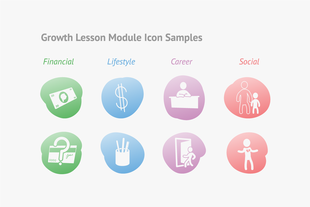
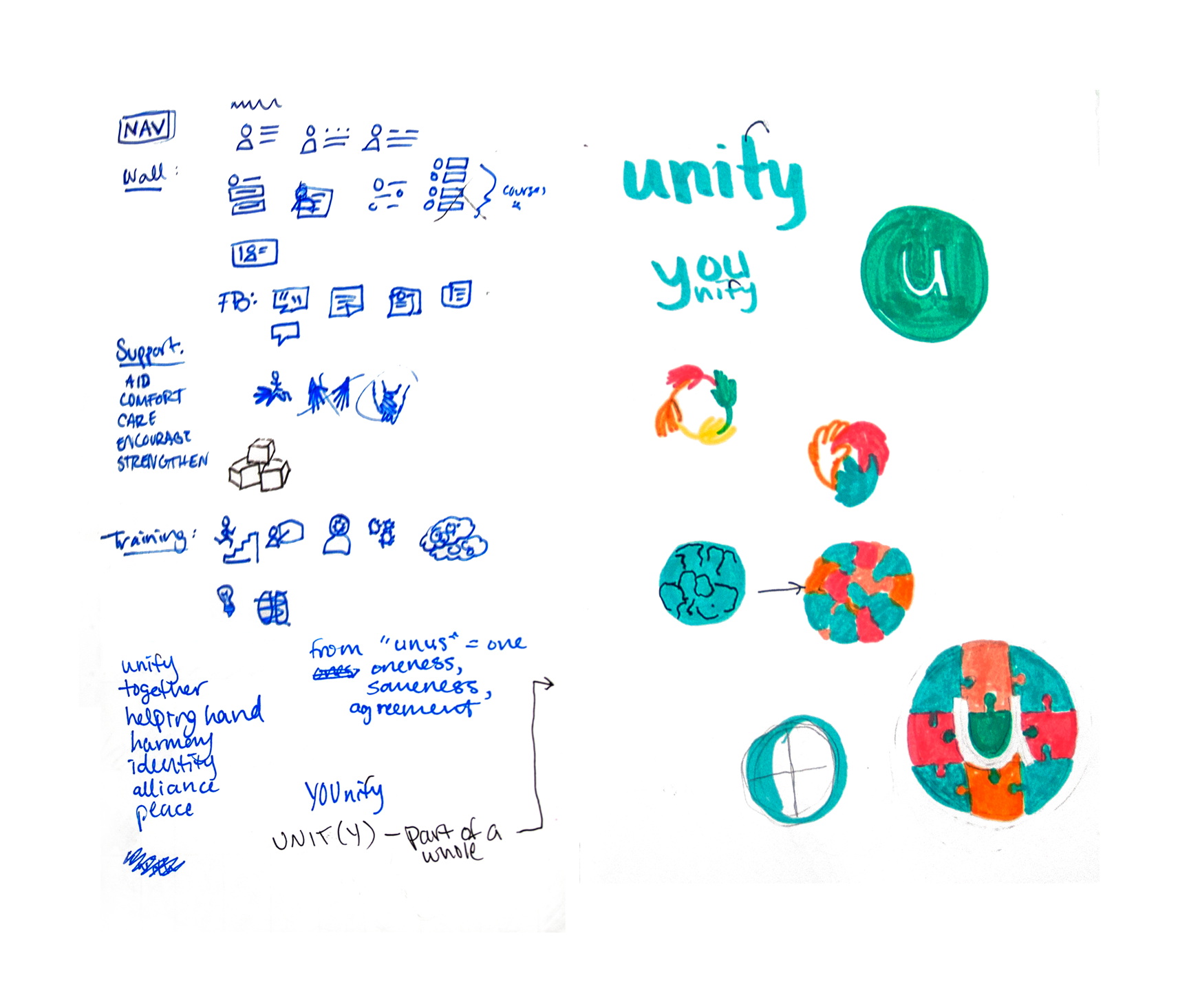
I was first tasked with creating four main navigation icons, one of which would dually serve as the app logo. At first we had subdivided the app into categories: social, suppport, training, and a home page. Originally the working title was "Unity," a name chosen to underline the aim of the app: to unite foster youths aging out of the system with the resources needed to better their transition into adulthood and the supportive adults in their lives for guidance along the way.
The title was soon edited to "Unify," though not by way of typo. The more we focused on the user as we worked through designs, we realized the active verb better represented the self empowerment the Think of Us mission aimed to impart on these young people. This theme I echo in my initial notes and eventually the final design; the spotlight shines on "u."
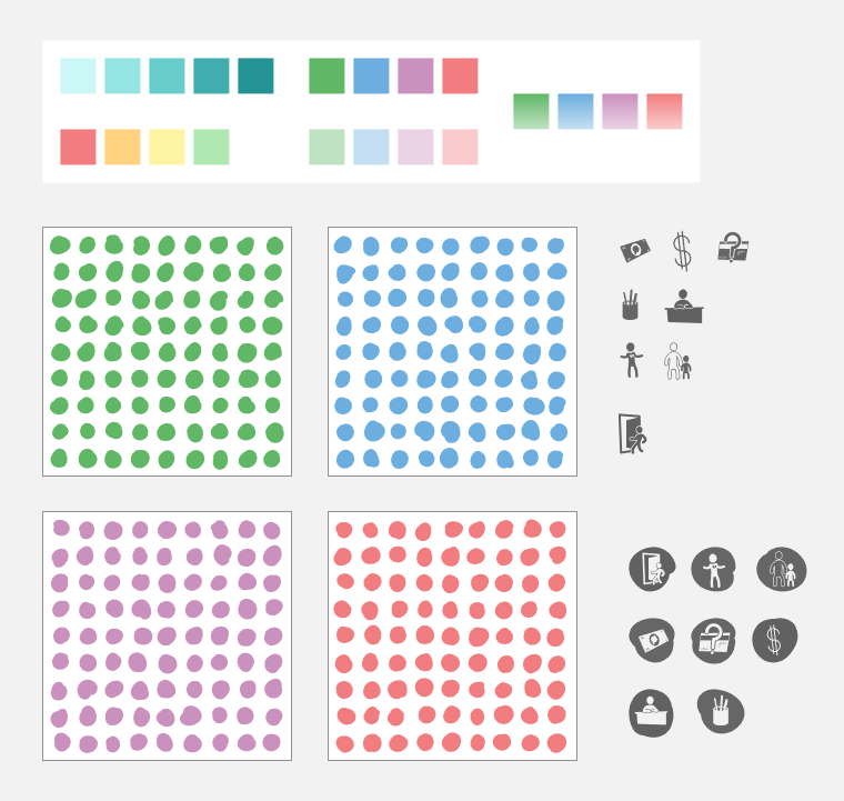
Drawing from the branding book I was concurrently designing, many of the icons and buttons include hand-drawn shapes and imperfect features to reflect the humanistic nature of the brand as a whole. We found these to elicit more familiarity with test users than circular flat icons; it seemed to soften the edges. This idea is iterated again in the motion graphic for the logo.
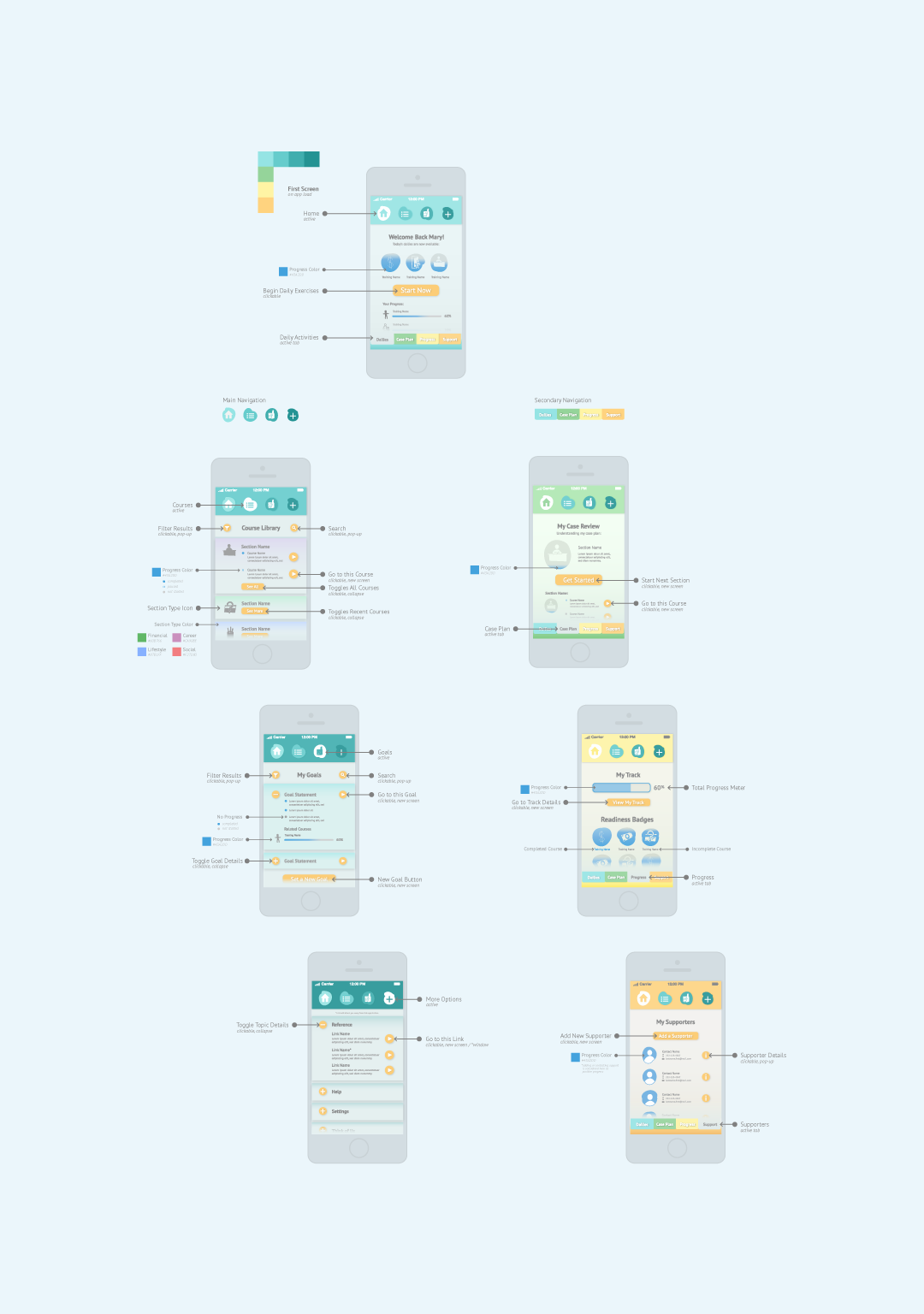
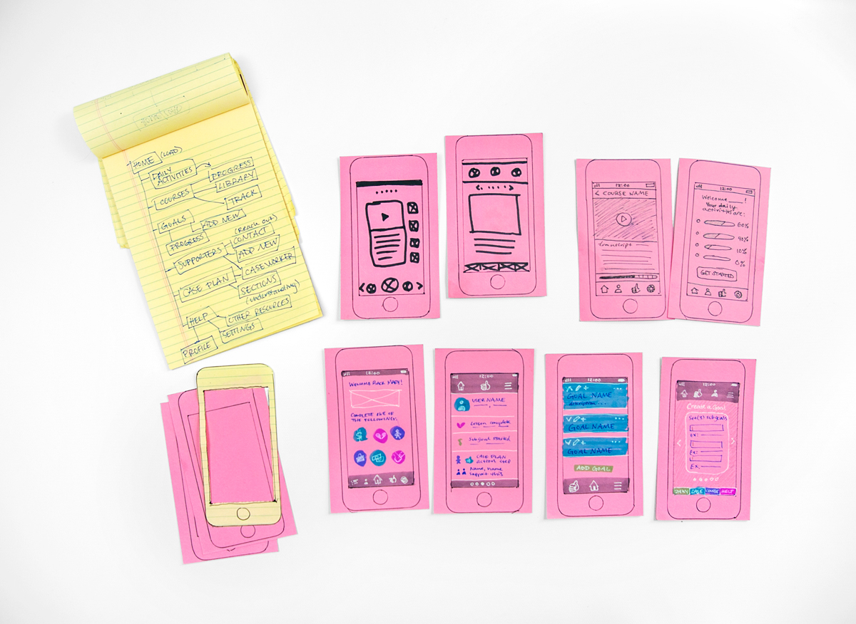
Creating the interface began with expanding our original main categories into a flow chart with all pages. This interwoven map grew extensively and with some editing, became the base structure we needed to build upon. Layouts were wireframed out with pens and index cards, then passed around and tested by hand. A top menu focused on the four main pages and a bottom tab menu was added to the home screen as a visual reminder of daily tasks and for ease of access.
TESTING
With a basis for the navigation worked out, I created an interface of the main screens using a gradated color scheme derived from the core colors. The focus with testing was to determine whether the navigation was intuitive to use or if users had a difficult time identifying interactive cues. Potential users were foster youths contacted through the Think of Us network; testing was done via video chat with a downloadable prototype produced through Flinto.
With a brief overview of the app, test subjects were asked to talk through their thought process as they naturally interacted with the app. This feedback led to creating and standardizing style guides for action buttons.