Adobe Illustrator
Adobe After Effects
Adobe Photoshop
Adobe Dreamweaver
HTML5
CSS3
jQuery
PROJECT
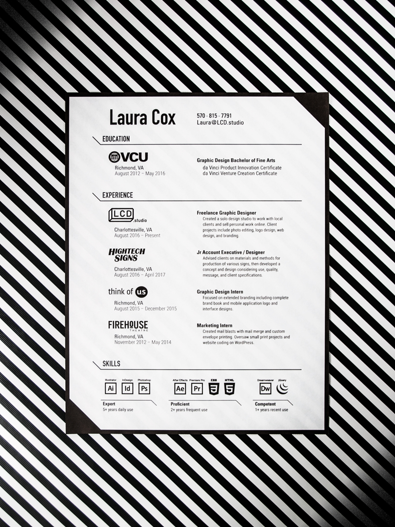
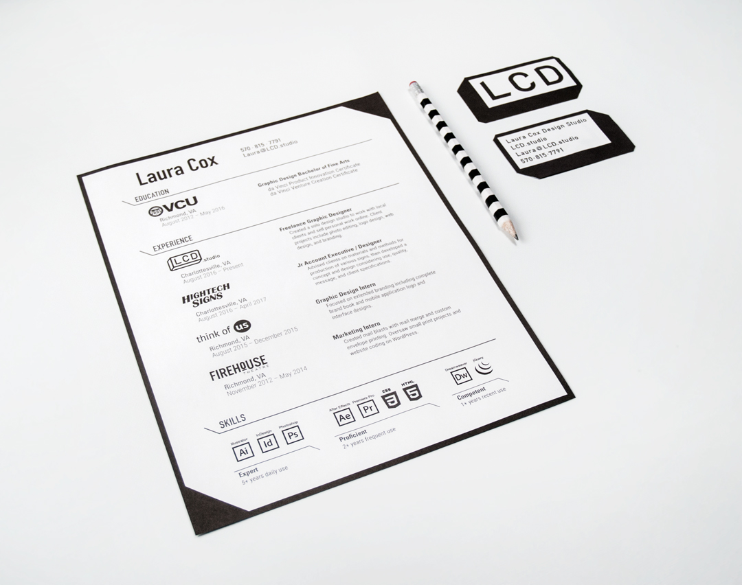
Creating a visual identity for myself has been a work in progress since the beginning of my design education. However it wasn't until I started to contract freelance work and to sell some of my other work that I needed to have something to identify myself. I also needed a better home for my exisitng work than the plain Cargo site I was previously using. I decided a custom built site would be the best environment to showcase my designs for future employers, clients, and customers to visit.
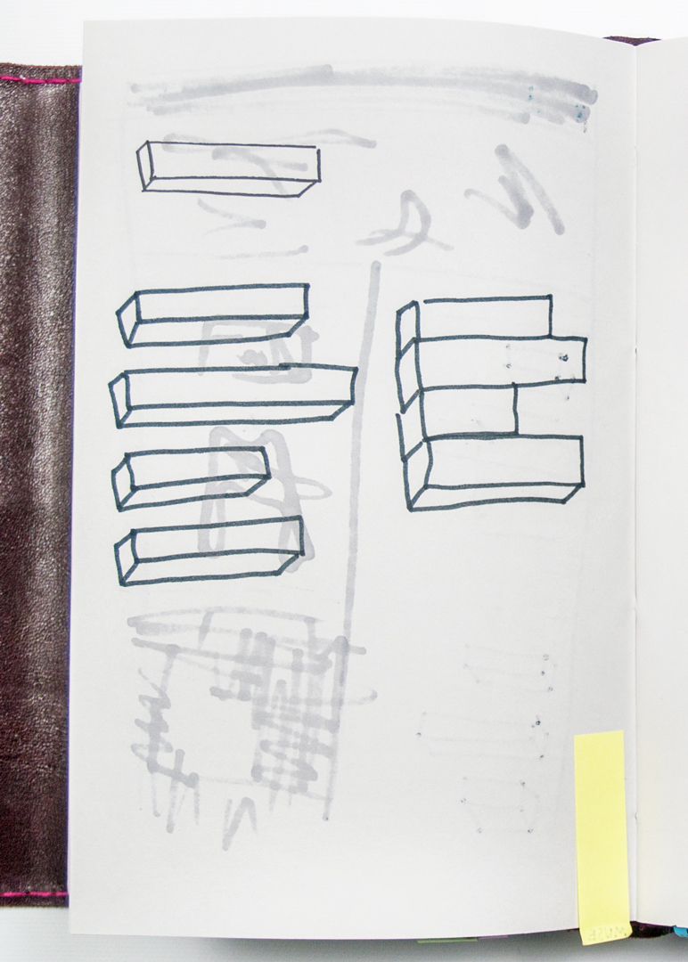
LOGO PROCESS
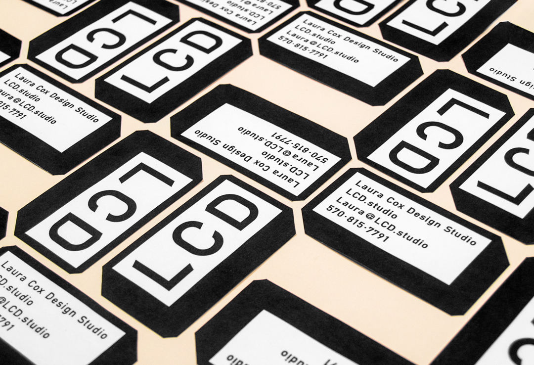
Though I had been ruminating on this for quite some time, I could never pin down the exact words I wanted to use for my identity. I certainly wanted my name to be a part of it and set to work dissecting and abbreviating and listing word and name combinations. Eventually I stumbled upon LCD Studio which felt so right when I said it aloud that I knew I found my answer.
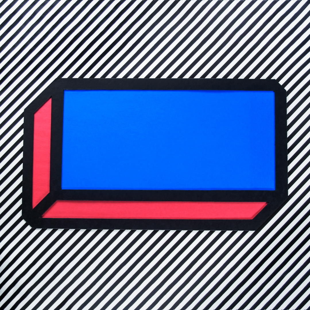
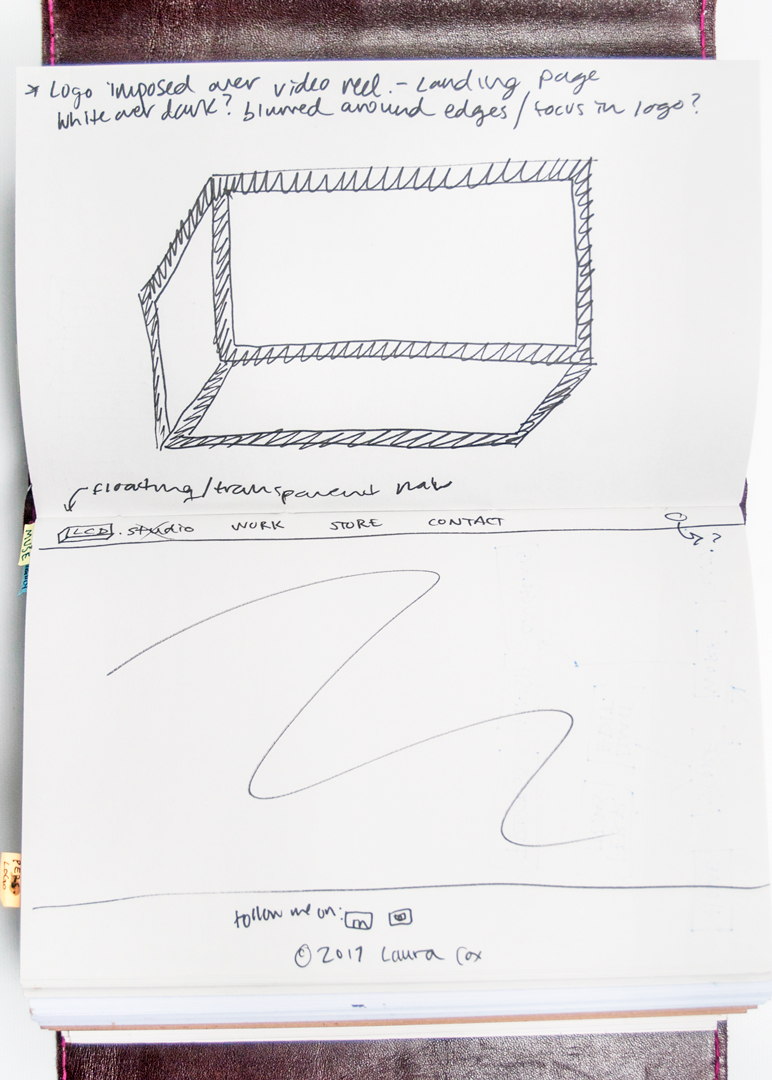
Separately from these word notes were sketches and doodles relating to my work as I saw it as a whole. I wanted a symbol that could be recreated in multiple mediums, work as a system, and be dissected into distinct parts. I favored a box design that to me represented the multiple perspectives and methods I utilize when first tackling a problem. It was also a subtle "L" shape, referencing my first name. With this design refined and in combination with the new found name, I had a basis for my logo.
Determining a color palette proved difficult as at first I wanted to stay strictly black and white. But thinking about my personality and my design work, I realized it was an important aspect I needed to explore. In choosing color, I looked at how I utilize color in my work, how I gravitate towards colors in my wardrobe (as an extension of my personality), and how I interacted with certain colors in real life. Though most of the final designs here feature little color, I chose red and blue to reiterate the 3D look of the logo, equal width stripes as added depth and pattern, and softer compliments of pink and beige.
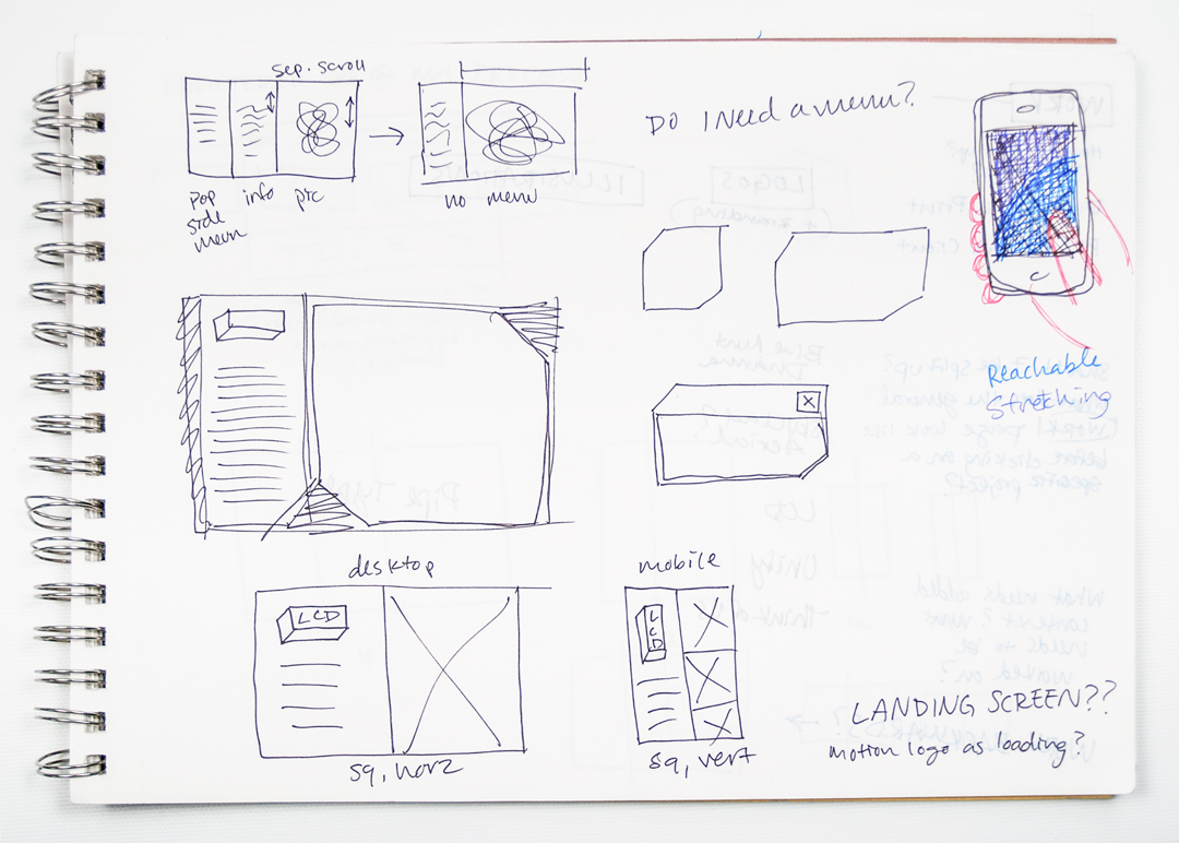
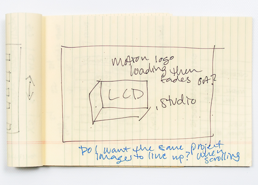
WEBSITE PROCESS
The reason for a custom site stemmed from my annoyance and boredom at many of my peers plain white portfolio sites. I'd fallen into the same trap as well when first hosting my work on premade portfolio site templates; they were all so similar. I wanted to show my work in its natural environment and set about creating a space that had my personality written all over it.
By the time I started building this website, I'd gone through three coding courses as well as tried online coding training from multiple different tutorials, yet I could not understand exactly how to build what I was envisioning. With this project, I took the opportunity to teach myself on my own terms. Instead of going step by step in understanding each element like the courses had taught, I dove headfirst into making the first version of the site with W3Schools and Google searches walking me through what I didn't understand.
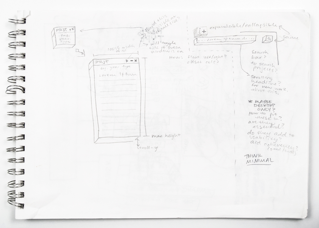
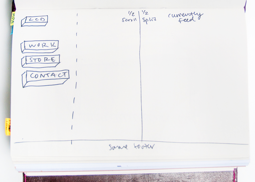
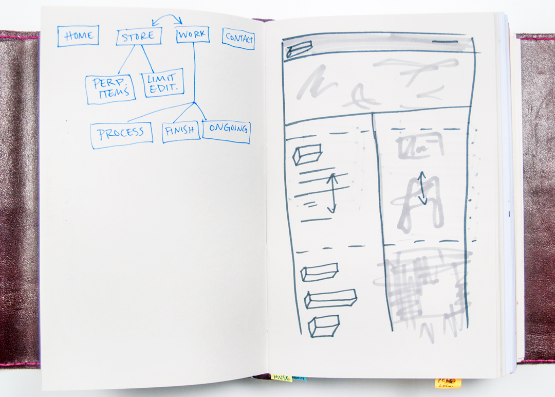
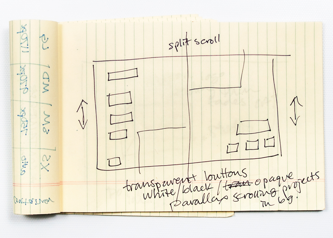
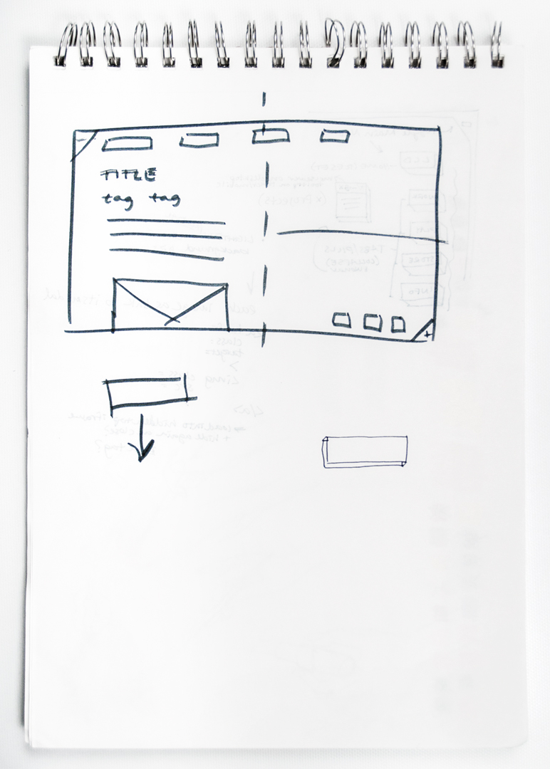
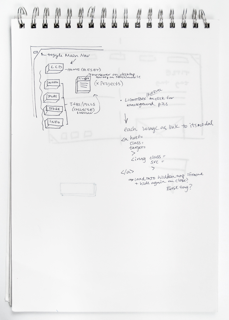
Perhaps it's just my learning style, but something clicked. Suddenly I had built a basic framework quicker than I expected. I started to learn about JavaScript and how to use jQuery to build some of the functions I was trying to execute. The design started changing to accomodate new interactions, but the split screen was an element from the get-go. My aim was to present my work alongside the process it took to arrive at the final product. I chose to split the screen evenly as I place an equal importance on both aspects of a design and wanted the site to reflect as much.
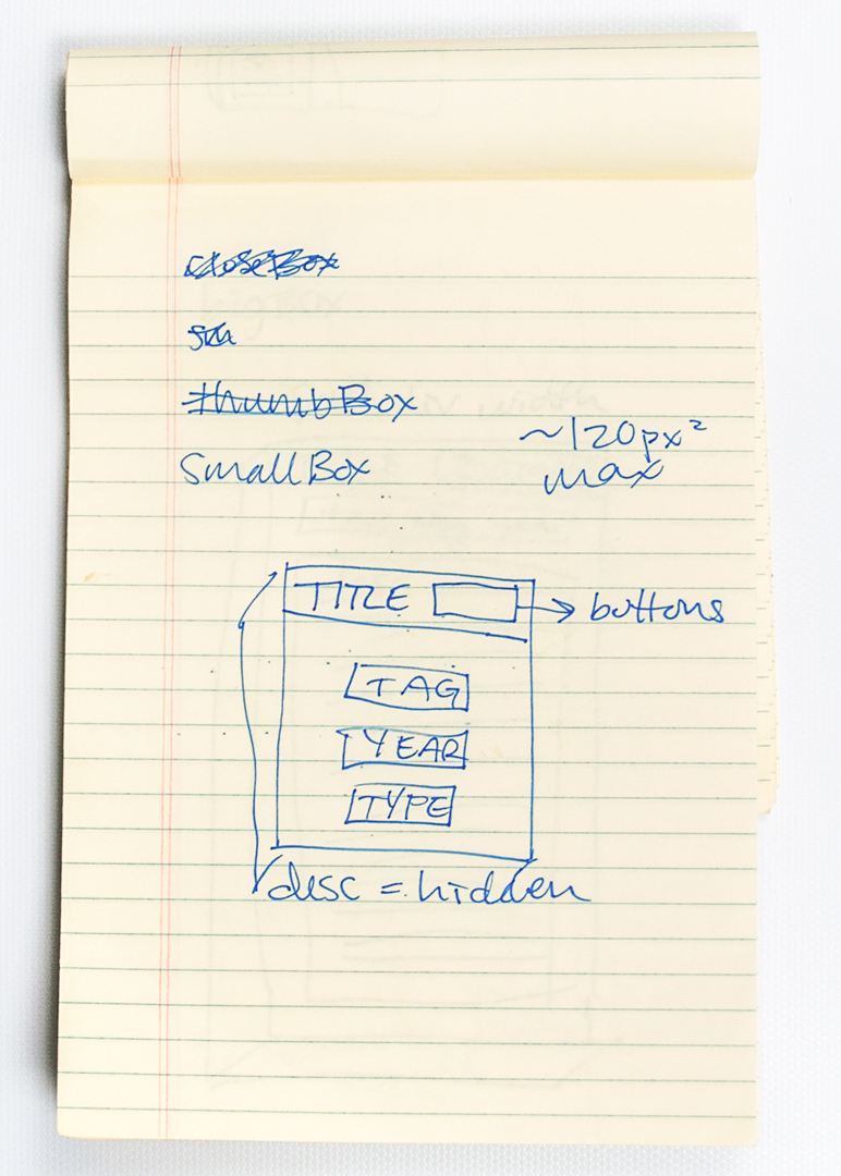
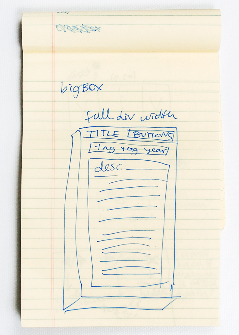
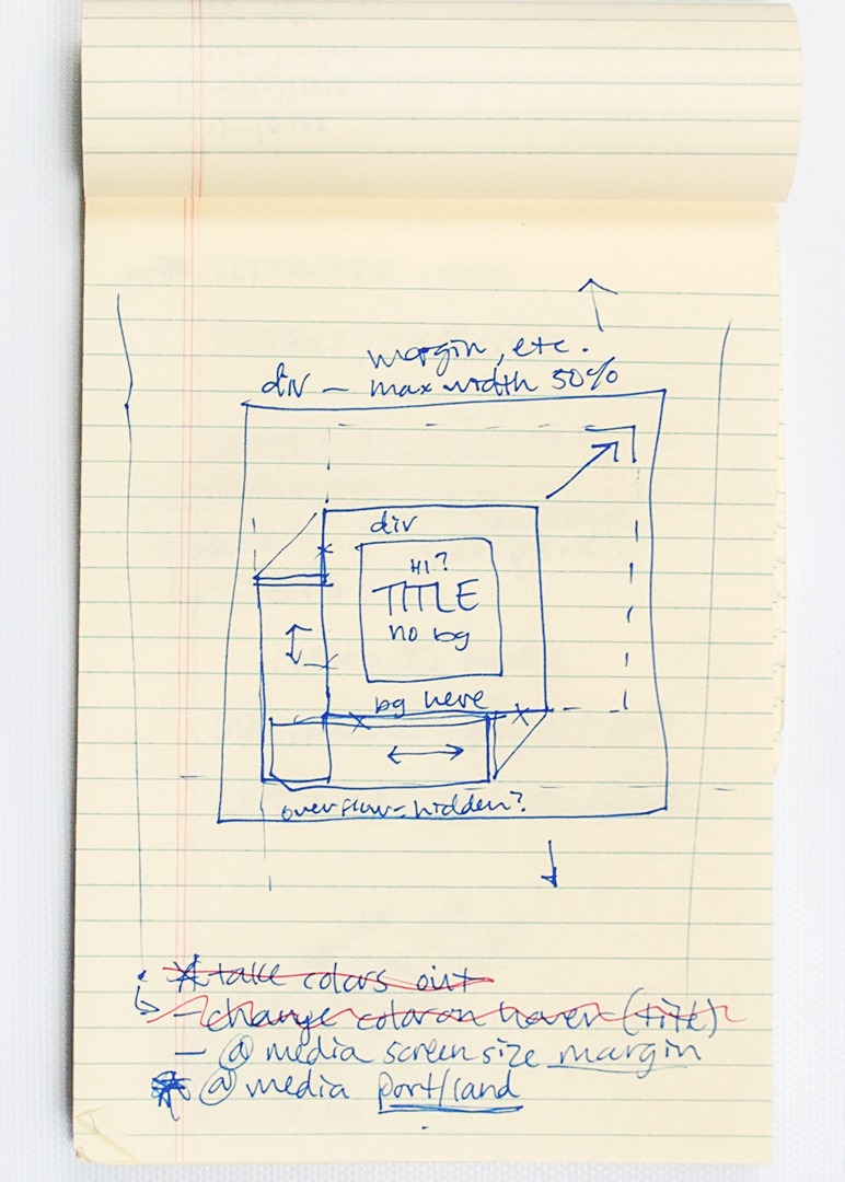
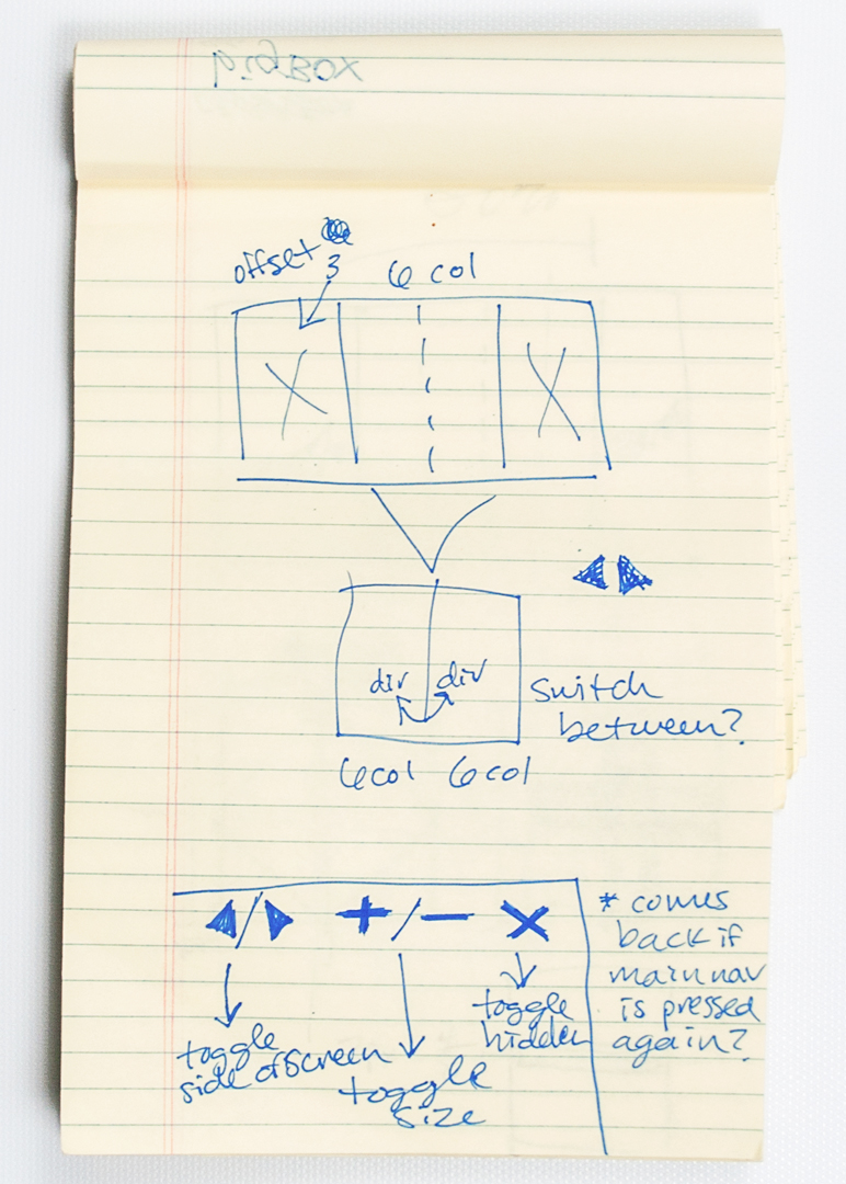
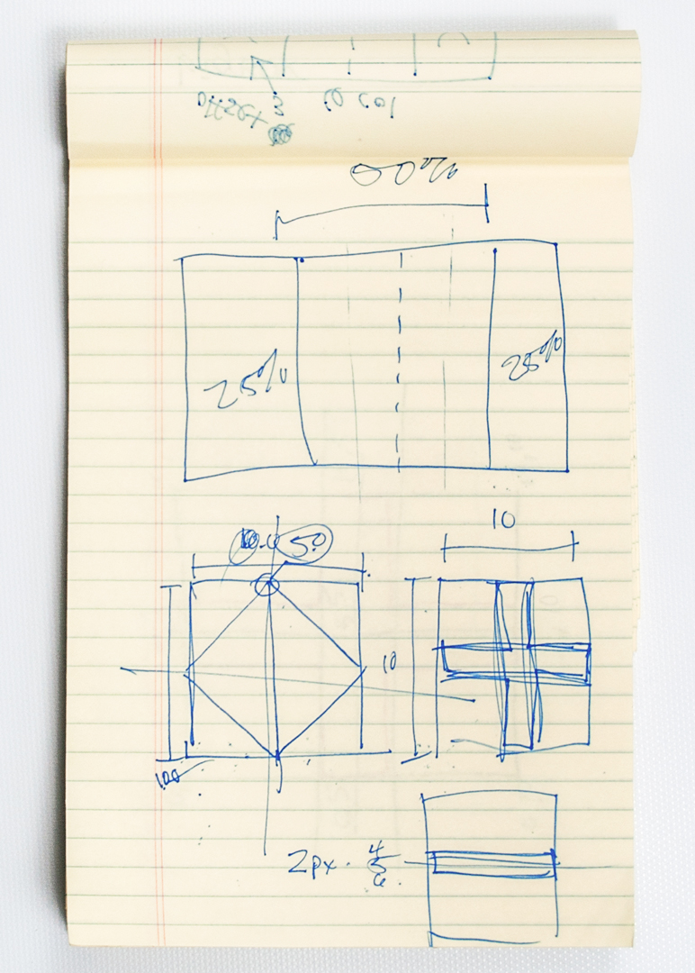
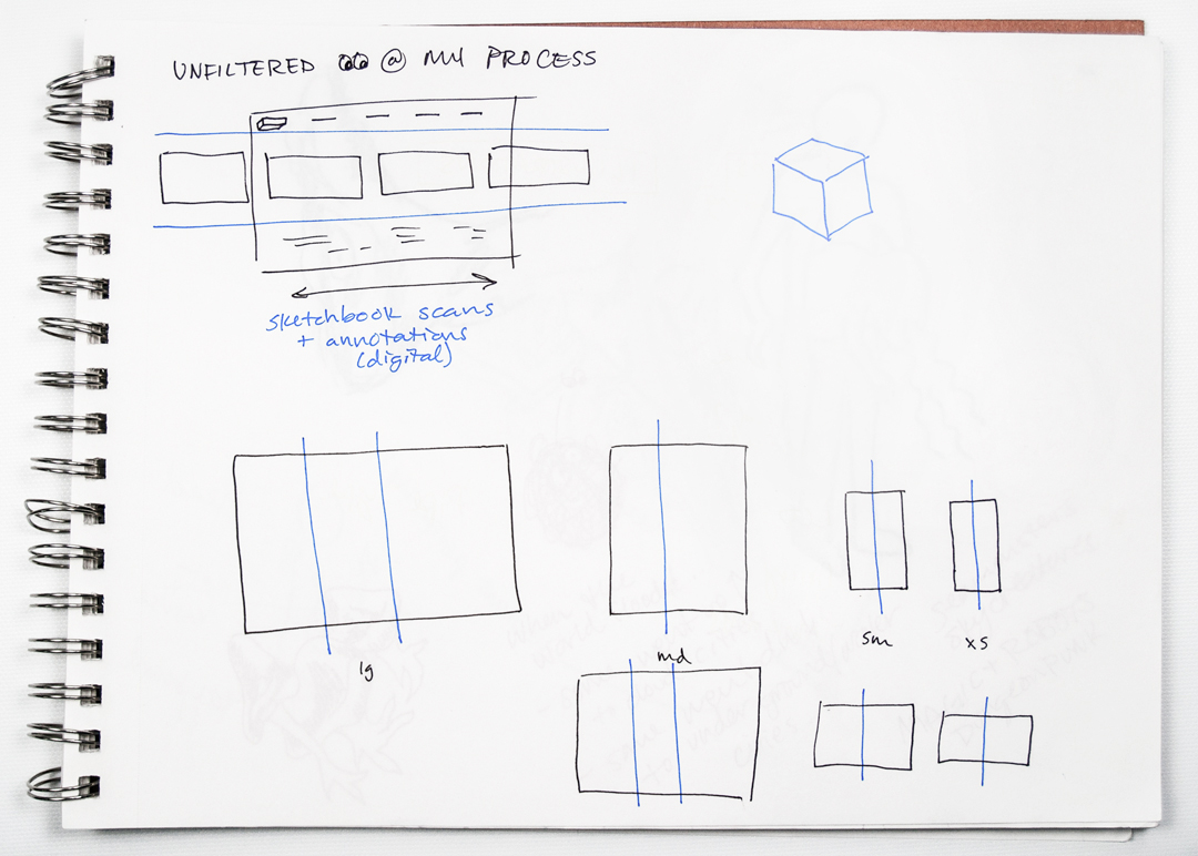
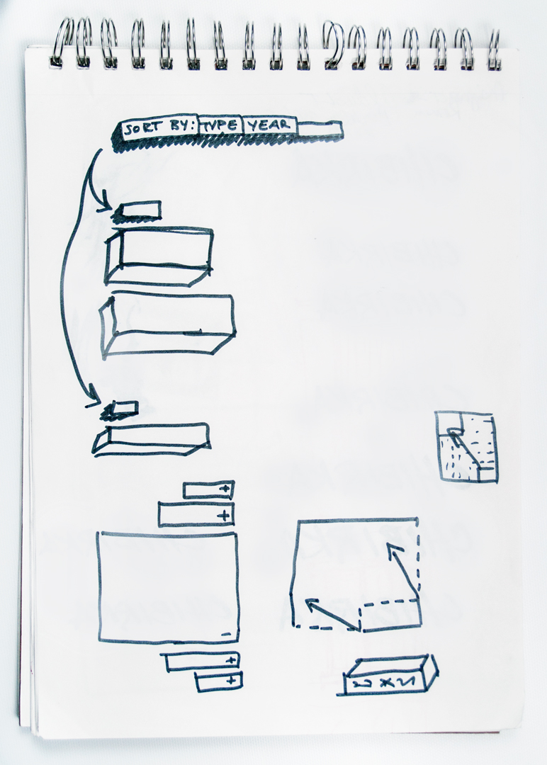
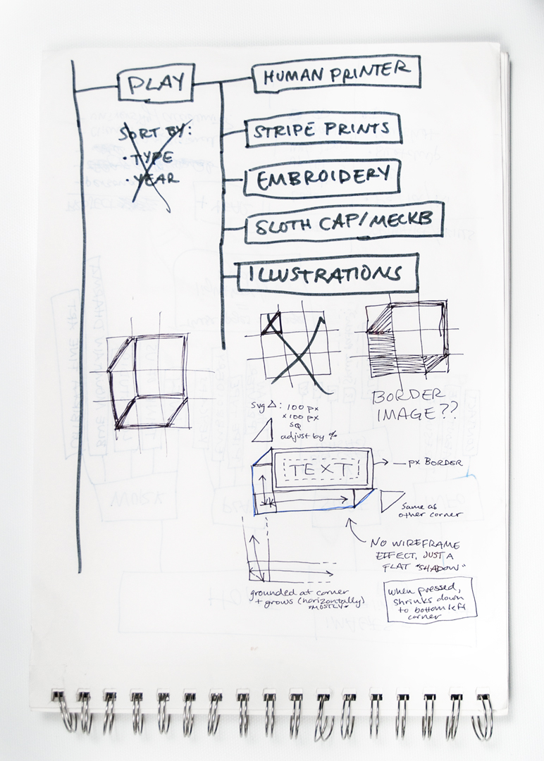
About halfway through coding the site using Bootstrap, I realized that I actually had no need for it. Using what I'd already written as a base, I rewrote and cleaned up the code. This led to the elimination of excess buttons, the realignment of menus, and easier to navigate copy. At this point, I focused on the details of placement in mobile versus tablet versus desktop. After first launching the site and observing how it behaved on different devices in their native browsers, I collected a list of all the small fixes. This modest list grew into another small redesign focusing on functionality.