Adobe Illustrator
Adobe InDesign
Adobe Photoshop
PROJECT
Being early for class finally paid off for me when chatting up majors with a fellow classmate who offered me a design internship at his organization. What started as a last-minute credit application quickly turned into the best learning experiences of my senior year. When I first joined the non-profit Think of Us, I trained for weeks in exercises and articles about color theory and user experience design; learned hands on how to code in HTML and CSS with Bootstrap; and studied the background and perspectives of the United States foster care system.
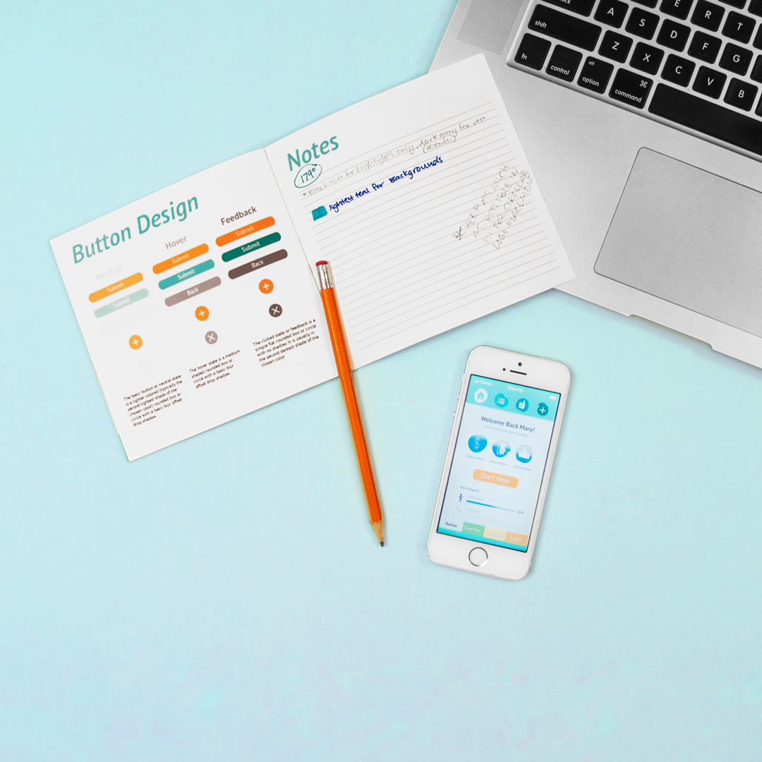
My main assignment was to aid my intern supervisor and front end developer in our new application design as well as maintain and update our existing website. Soon other departments tasked me with video overlays, interactive button sets, and information designs. I quickly realized the lack of any organized system of company visuals could solve or significantly speed up many of these tasks our whole team came across on a daily basis.
PROCESS
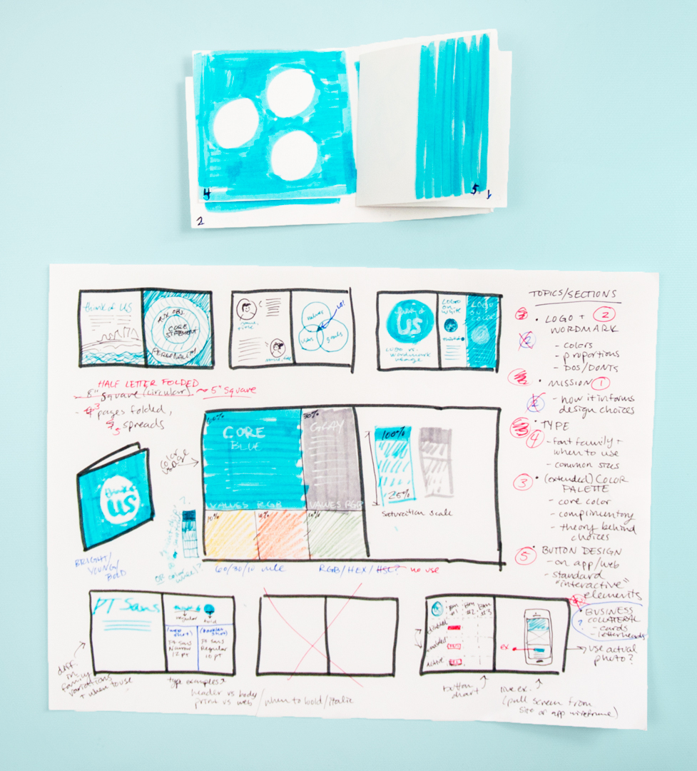
My proposal for brand style guidelines was approved and I began to gather as much existing information as possible, digging through old folders and documents as well as meeting with team heads to rack their brains for anything not written down. These accounts, along with sorting through and revisiting the past design files, painted a bright journey of the organization I only needed to put down on paper.
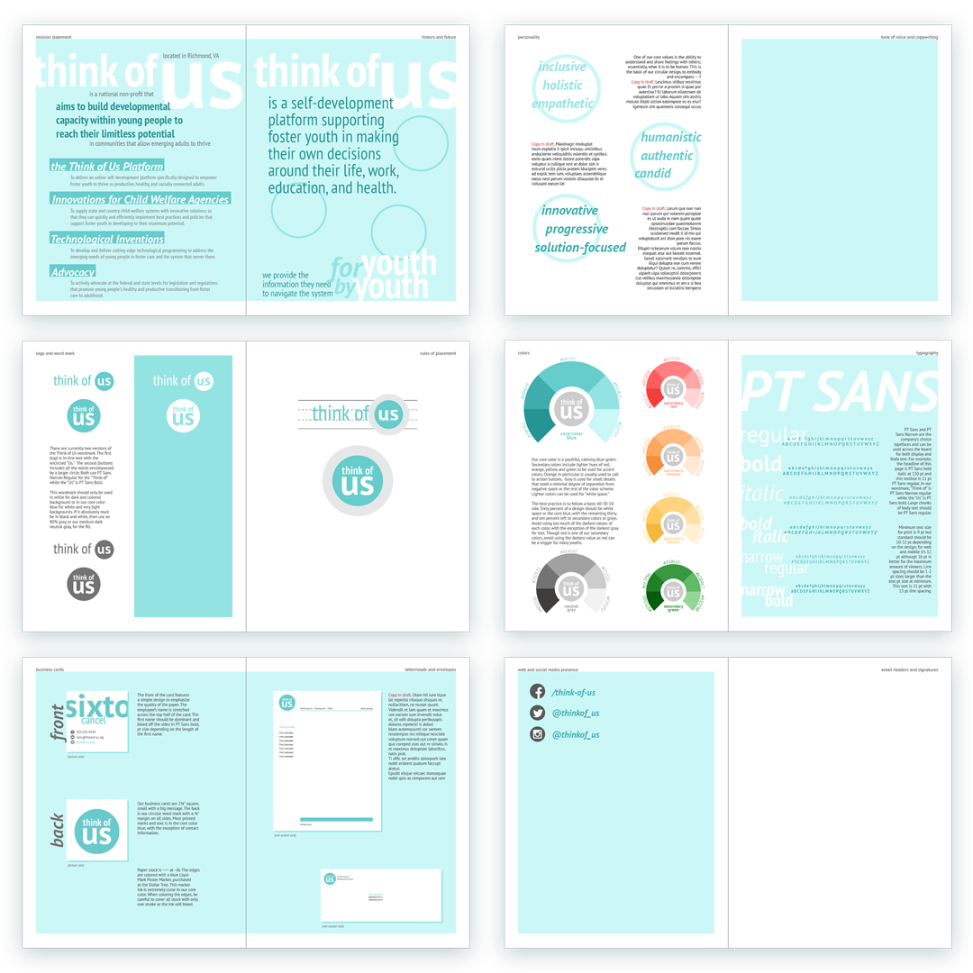
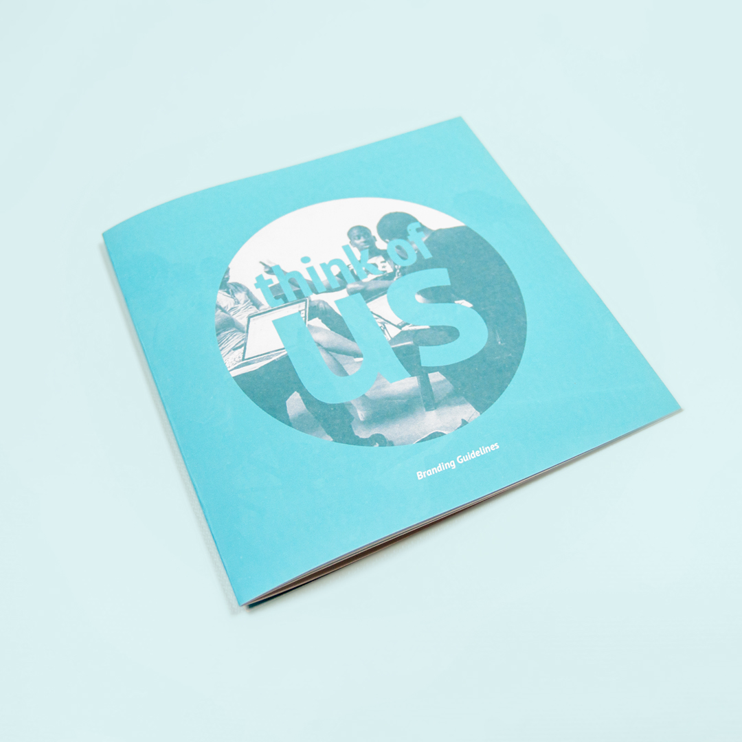
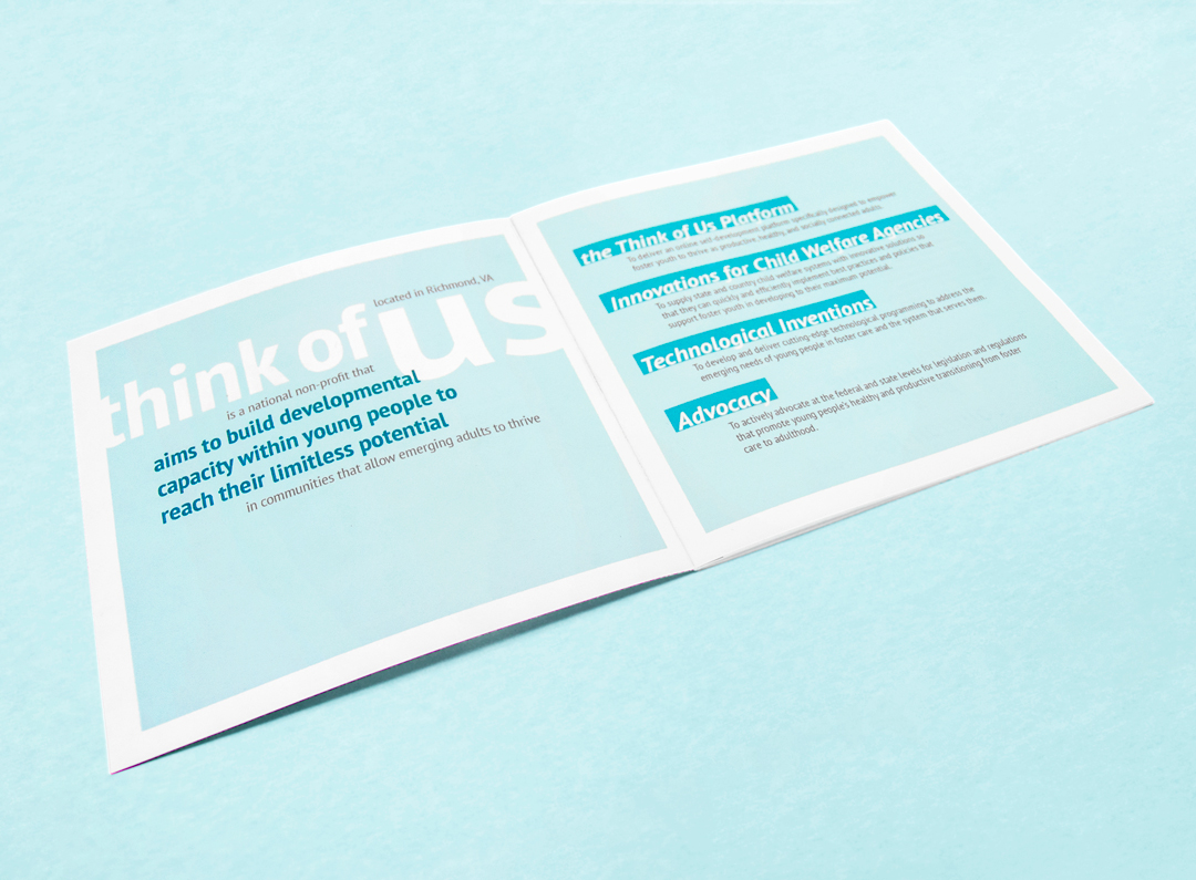
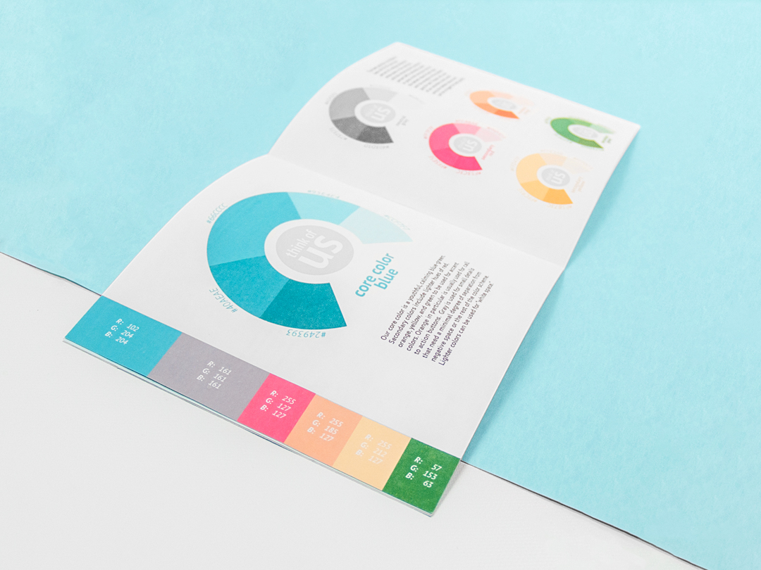
My objective was to create a portable and durable booklet that was easy to use on a daily basis. The content focused on guidelines for the brand including logo, colors, display, typeface that fellow team members could quickly access and new team members could pick up. As far as production, I wanted the final design to be recreated, updated, and reprinted with little problem. This lead to the design fitting into a template for an online print vendor as well as on standard letter paper.
While iterating layout designs, I found I had difficulty nailing down a visual aesthetic for the guidelines overall. At the next all hands meeting, I took the opportunity to start a discussion about the personality of the brand and concisely summing up our mission. This conversation not only ended up as part of the guidelines but lead me to pare down unnecessary content and page space.
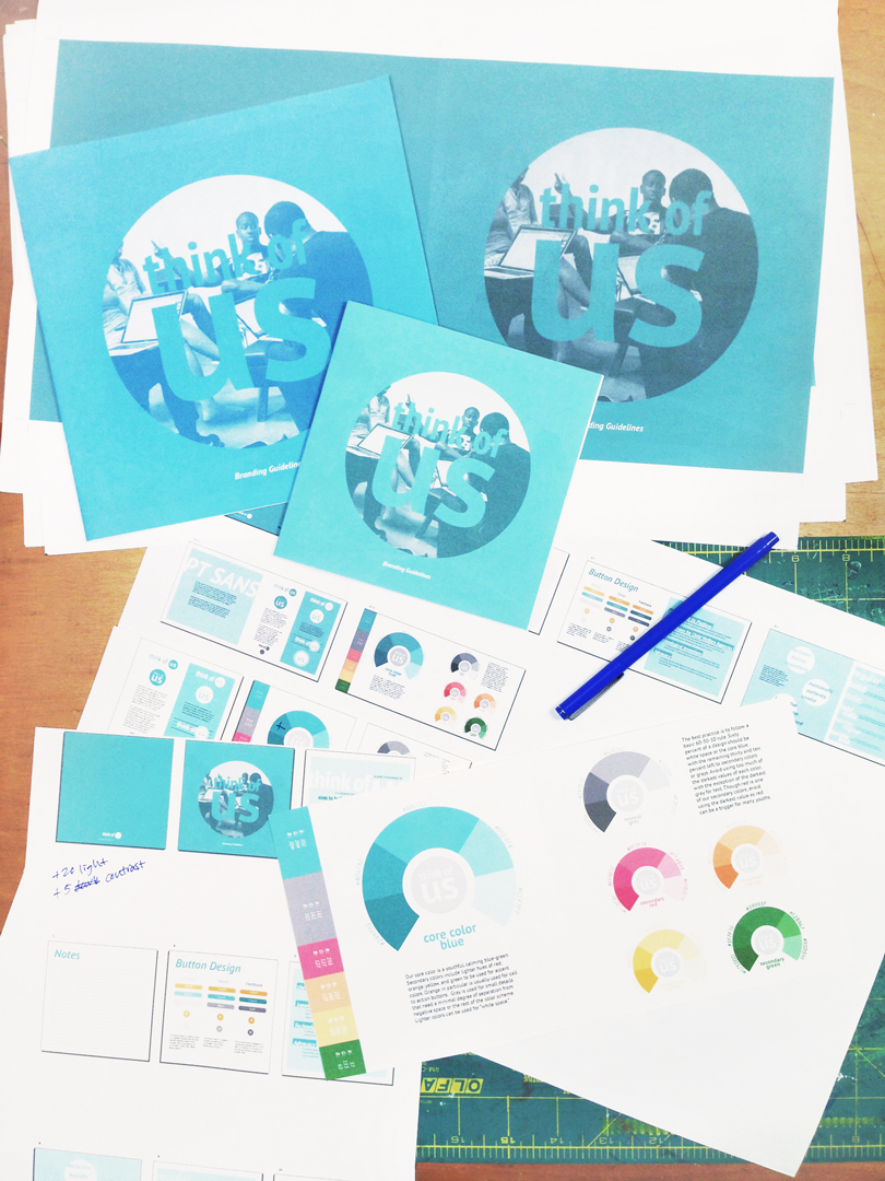
Final edits were all made after test printing each spread at full size. I evaluated each together and separately, trading pages to test pacing, and finally cropping and binding each into a book. Subsequent test prints were utilized for perfecting colors and spacing.