Adobe Illustrator
Adobe Photoshop
PROJECT
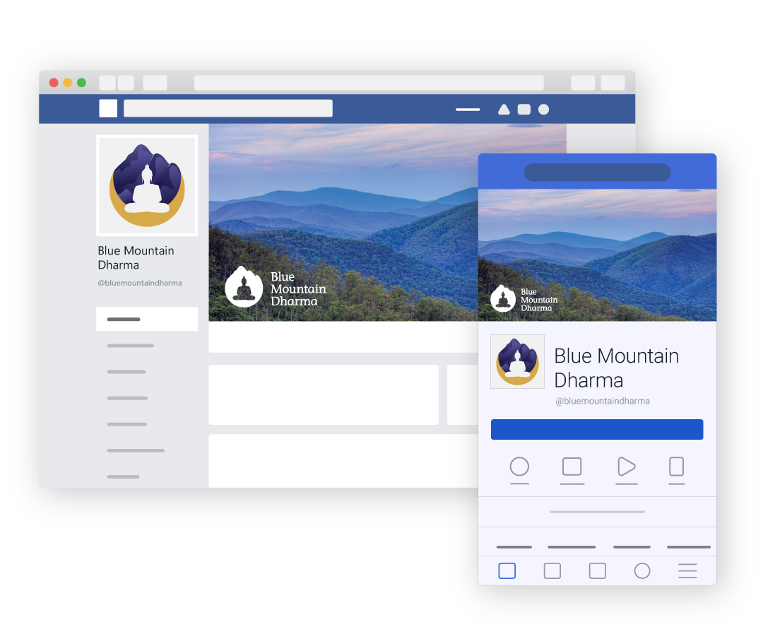
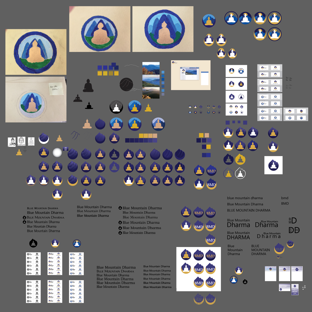
Blue Mountain Dharma is a local buddhist group who sought me out to aid in creating a logo for their organization. A member had painted a few samples for reference and asked that I come up with a formal logo. By using these paintings as inspiration alongside the surrounding landscape of the beautiful Blue Ridge Mountains, I drafted multiple combinations of pen drawn silhouettes before narrowing down a varied set of possible contenders.
PROCESS
For the Buddha silhouette, I researched traditional and modern depictions of Buddha and drew elements from each to create a recognizable likeness. The addition of simple facial features was considered in the initial stages of the designs but later discarded.
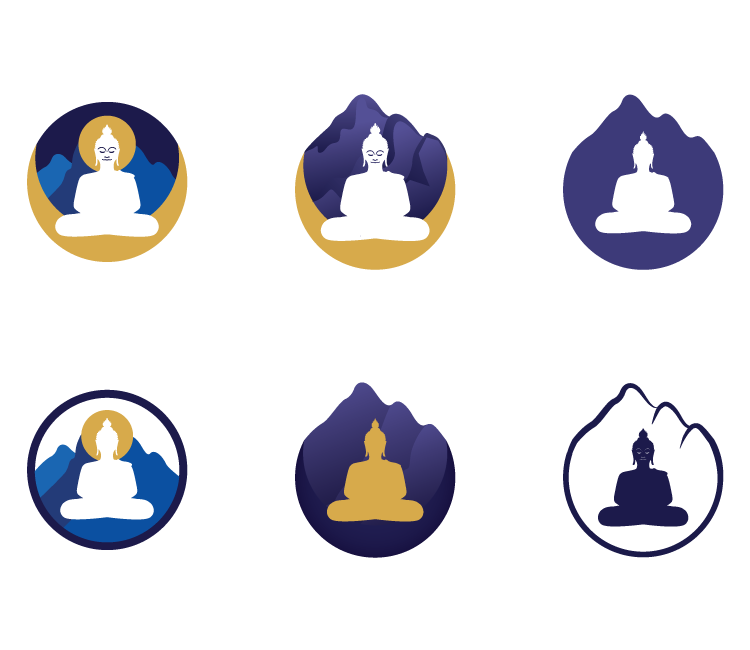
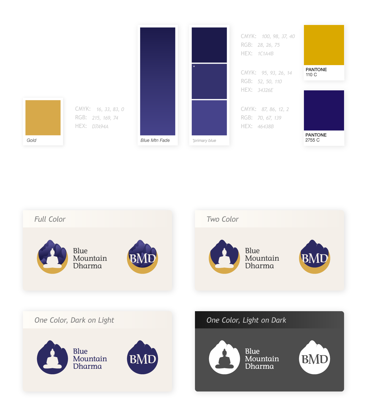
I'd been living in Charlottesville for a year and never grown tired of seeing the Blue Ridge Mountains; the colors seemed more saturated here than the Appalachian mountains I grew up looking at in northern Pennsylvania. That specific blue is what I wanted to capture when starting to build a color palette. In contrast I wanted a gold reminiscent of the metallic paint used in the original inspiration. Though that paint color was warmer, I adjusted the golden color of the logo to more yellow hue to compliment the indigo blue.
Feedback from the initial set of designs revealed an additional condition of the logo: according to their beliefs, the image of Buddha should not be disposed, and so they could not use the Buddha figure for any print materials. While this may have put a brake on the design of the logo itself, it also fueled my search for the right type match. My aim was to find a semi-serif with curves that echoed the ones of the figure's silhouette.
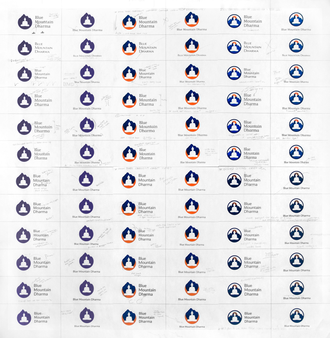
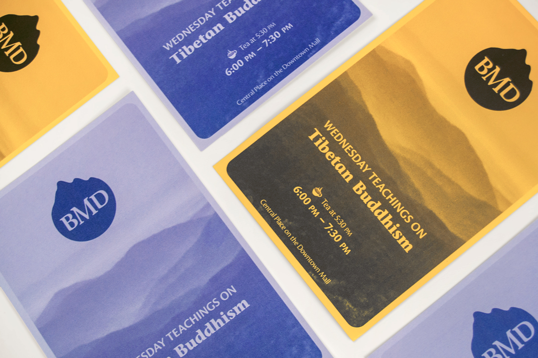
From a large collection of possible choices, I narrowed down the fonts to six families each of serifs and sans. I typeset each alongside the two final logo symbols, horizontal and vertical layouts. To review, I printed each and made notes about each pairing. Two of each type were chosen for final presentation. With the chosen typeface, I created a secondary logo option for print ephemera featuring a modified monogram of the group's name.